Understanding the Impact of Color on Mood and Emotions
Color has a profound impact on our mood and emotions. The colors we surround ourselves with can evoke different feelings and reactions, influencing our overall well-being. For example, warm colors such as reds, oranges, and yellows are often associated with energy, passion, and excitement. These vibrant hues can create a sense of warmth and stimulation in a space.
On the other hand, cool colors like blues, greens, and purples tend to have a calming effect. They can promote relaxation and tranquility in a room. Lighter shades of these cool tones can create an airy and peaceful atmosphere while darker shades may evoke a sense of mystery or introspection.
It’s important to consider the specific function of each room when choosing color schemes for your home. For instance, if you want to create an inviting atmosphere in your living room or dining area where social interactions take place, using warm tones like earthy browns or soft neutrals could be beneficial. On the contrary, if you’re aiming for a serene environment in your bedroom or study where relaxation is key, cooler shades like pastel blues or soothing greens might be more suitable.
The impact of color on mood is undeniable; it has the power to influence how we feel within a given space. By understanding the emotional associations that different colors carry and considering their effects on our moods when selecting paint colors for various rooms in our homes, we can create spaces that enhance our well-being and support the intended functions of each area without even realizing it
• Warm colors such as reds, oranges, and yellows evoke feelings of energy, passion, and excitement.
• Cool colors like blues, greens, and purples have a calming effect and promote relaxation.
• Lighter shades of cool tones create an airy and peaceful atmosphere while darker shades may evoke mystery or introspection.
• Consider the specific function of each room when choosing color schemes for your home.
• Use warm tones in social areas to create an inviting atmosphere for social interactions.
• Use cooler shades in bedrooms or study areas to promote relaxation and tranquility.
• The impact of color on mood is undeniable; it has the power to influence how we feel within a given space.
• By understanding the emotional associations that different colors carry, we can create spaces that enhance our well-being.
Exploring the Principles of Color Theory for Home Decor
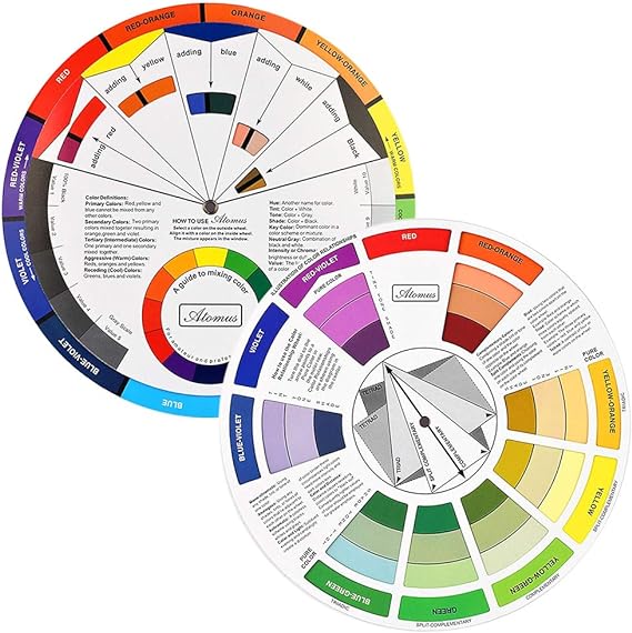
Color theory is an essential aspect of home decor that can greatly impact the overall ambiance and mood of a space. Understanding the principles of color theory allows homeowners to create harmonious and visually appealing interiors. One important concept in color theory is the color wheel, which consists of primary, secondary, and tertiary colors. By utilizing this tool, individuals can effectively combine colors to achieve desired effects.
Another principle to consider when exploring color theory for home decor is the concept of warm and cool colors. Warm colors such as reds, oranges, and yellows tend to create a cozy and inviting atmosphere, while cool colors like blues, greens, and purples evoke a sense of calmness and tranquility. It’s crucial to strike a balance between these two categories when selecting colors for different rooms in order to achieve the desired emotional response.
Additionally, understanding the psychology behind different hues can help homeowners enhance the functionality of each room. For example, using blue tones in bedrooms can promote relaxation and better sleep quality. On the other hand, vibrant shades like yellow or orange are often used in kitchens or dining areas as they stimulate appetite and encourage social interaction. By considering both personal preferences and psychological effects associated with various colors, individuals can create spaces that not only look aesthetically pleasing but also serve their intended purposes effectively.
Factors to Consider When Choosing Paint Colors for Different Rooms
When choosing paint colors for different rooms in your home, there are several factors to consider. First and foremost, you should take into account the purpose of each room. For example, if you’re painting a bedroom, it’s important to choose calming and soothing colors that promote relaxation and sleep. On the other hand, if you’re painting a home office or study area, you may want to opt for colors that enhance focus and productivity.
Another factor to consider is the size of the room. Lighter shades tend to make smaller spaces appear larger and more open, while darker hues can create a cozy and intimate atmosphere in larger rooms. Additionally, natural lighting plays a significant role in color selection. Rooms with ample sunlight can handle bolder or warmer tones without feeling overwhelming or dark.
Lastly, it’s essential to think about the overall aesthetic of your home when selecting paint colors for different rooms. Consider how each room will flow into one another and ensure that there is some level of coherence throughout your space by using complementary or analogous color schemes.
By taking these factors into consideration when choosing paint colors for different rooms in your home, you can create an environment that not only looks visually appealing but also supports the intended function of each space.
The Role of Natural and Artificial Lighting in Color Selection
- 【High Speed HVLP Spray Paint Gun】PHALANX 700W spray painter is equipped with a high speed motor and powerful turbo fan, which makes it paint faster, smoother and even, greatly improving the painting quality.
- 【150DIN High Viscosity】This electric paint gun adopts 150DIN viscosity, making it suitable for most paints. This powerful spray-painting gun can ensure that you can finish all kinds of painting projects quickly and smoothly. Great for home improvement and DIY lovers.
- 【Lightweight Design & 10FT Flexible Air Hose】The body separation design makes the spray gun only weigh 1LB, which greatly relieves the pressure on arm and hand. Lengthened hose makes the painting range up to 780FT². Ideal for beginners.
- 【4 Nozzles & 3 Patterns】4 nozzles (1.5mm/2.0mm/2.5mm/3.0mm) can meet different painting requirements! By adjusting the air cup, 3 painting patterns can be obtained to finish your project. Air flow knob can adjust the flow to realize accurate output and save materials.
- 【ETL Certified & Warranty】It has ETL certification from the authoritative organization to ensure product quality and safety. And it also has 30 days UNCONDITIONAL return. Any questions, contact [service@phalanxtools.com] or call me at (+1)8772199866.

- WHERE TO USE THIS COLOR – BRIGHT WHITE (SATIN FINISH)– Our brightest white color found in high traffic areas such as kitchens and bathrooms
- REPAIR AND RESTORE IN MINUTES. Help get your rental deposit back, cover up the scuffs and knicks from kids, movers, pets or anything else life throws your way. With the bottle in brush design and quick drying, self-priming formulation, your living space will be looking great again with ease
- SKIP THE TIME-CONSUMING SETUP, SUPPLIES AND MESS. All in one bottle in brush design avoids heavy cans, prying, stirring, spilling, taping, drop cloths, pans, rollers, special brushes, and splatter. Simple to done, and back to life
- REDUCE THE PAINSTAKING COLOR GUESSWORK. Our curated color palette is based off the most popular shades of white used in homes, apartments, rentals, new home construction, and more
- DURABLE, ROBUST, YET EASY TO CLEAN – ready for life design, that is stain and scuff resistant, while also having exceptional washability to keep your walls, cabinets, trim, furniture and more looking their best
When selecting colors for your home, it is important to consider the role of natural and artificial lighting. Lighting has a significant impact on how colors appear in a space, influencing their intensity and hue. Natural light can vary throughout the day, with different color temperatures that affect how colors are perceived. For example, cool daylight can make blues and greens appear more vibrant, while warm sunlight can enhance warmer tones like reds and yellows. Artificial lighting also plays a crucial role in color selection as different types of bulbs emit varying color temperatures. Warm white bulbs create a cozy atmosphere and complement warm-toned colors, while cool white bulbs provide a crisp look that pairs well with cooler shades.
The amount of natural light entering a room should also be considered when choosing paint colors. Rooms with ample natural light can handle darker or bolder hues without feeling overwhelming or dimly lit. On the other hand, rooms with limited natural light may benefit from lighter shades to maximize brightness and create an illusion of spaciousness.
Additionally, it is essential to evaluate how artificial lighting will interact with chosen paint colors during evening hours or when there is minimal sunlight available. The type of artificial lighting used in each room should align harmoniously with the selected color palette to achieve desired effects. Experimenting with different bulb options before finalizing your choices can help ensure that you achieve the desired ambiance in each space.
By considering both natural and artificial lighting when selecting paint colors for your home, you can create an environment where colors truly shine and evoke the desired mood or atmosphere within each room.
Creating Harmony and Balance with Color Schemes in Your Home
When it comes to creating harmony and balance with color schemes in your home, there are a few key factors to consider. First and foremost, it’s important to choose colors that complement each other well. This means selecting hues that are either analogous (next to each other on the color wheel) or complementary (opposite each other on the color wheel). By sticking to these harmonious combinations, you can ensure that your overall color scheme is visually pleasing and balanced.
Another aspect of achieving harmony and balance with color schemes is considering the intensity of the colors you choose. Bright, bold colors can create a sense of energy and excitement in a space, while softer, more muted tones can promote relaxation and tranquility. It’s important to strike a balance between these different intensities throughout your home so that no one room feels overwhelming or underwhelming compared to the rest.
Lastly, don’t forget about the role of neutrals in creating harmony within your color scheme. Neutrals such as whites, grays, beiges, and browns provide a grounding effect for bolder colors and help tie everything together. They act as a backdrop for pops of vibrant hues or serve as calming elements when paired with softer shades. Incorporating neutrals strategically throughout your home will contribute to an overall cohesive look and feel.
By carefully selecting complementary or analogous colors, balancing their intensity levels throughout your space, and incorporating neutral tones effectively into your design scheme, you can achieve harmony and balance with color schemes in your home. These considerations will help create an aesthetically pleasing environment where every room flows seamlessly into the next without overwhelming or underwhelming any particular area.
Using Color Psychology to Enhance the Functionality of Each Room

- Please__contact us to solve the problem w/ name: The Color Wheel 5324CW Magic Palette Personal Mixing Guide New by_alreadyshipped
![[Old Version] Painter 2022 Upgrade | Professional Digital Painting Software | Illustration, Concept, Photo & Fine Art [Mac Download]](https://m.media-amazon.com/images/I/516DzzTcF2S._SL160_.jpg)
Color psychology plays a crucial role in enhancing the functionality of each room in your home. By understanding how different colors can affect our mood and emotions, you can create spaces that promote relaxation, productivity, or creativity. For example, if you want to design a calm and peaceful bedroom, consider using soothing colors like soft blues or gentle greens. These hues are known to evoke a sense of tranquility and help promote better sleep.
In contrast, if you’re looking to boost energy and productivity in your home office or study area, vibrant colors like yellow or orange can be highly effective. These shades are associated with enthusiasm and stimulation, helping to keep your mind focused and alert during work hours. Additionally, incorporating pops of red into an exercise room or workout space can increase motivation and intensity during physical activities.
Another important aspect of color psychology is considering the size of the room when selecting paint colors. Lighter tones such as whites or pastels tend to make small rooms appear more spacious by reflecting natural light effectively. On the other hand, darker shades like deep purples or rich browns can add warmth and coziness to larger rooms.
By applying color psychology principles when choosing paint colors for each room in your home, you have the power to create environments that support specific functions while also evoking desired emotional responses from those who inhabit them. So whether it’s creating a serene sanctuary for restful nights’ sleep or designing an inspiring workspace for maximum productivity – let color be your ally!
Tips for Selecting the Right Paint Finish for Different Surfaces
When selecting the right paint finish for different surfaces in your home, it’s important to consider both functionality and aesthetics. For high-traffic areas such as hallways or kitchens, a durable and washable finish like satin or semi-gloss is recommended. These finishes are resistant to stains and can easily be wiped clean, making them ideal for areas prone to spills or dirt.
In rooms where you want to create a more refined and elegant look, such as living rooms or bedrooms, a matte or eggshell finish is often preferred. These finishes have a low sheen level that helps hide imperfections on walls while providing a smooth and velvety appearance. They also tend to be less reflective than glossier finishes, which can help reduce glare from natural or artificial lighting.
For surfaces with unique characteristics like trimwork or cabinetry, choosing an appropriate paint finish is crucial. A glossy finish works well on these types of surfaces as it adds depth and highlights their architectural details. On the other hand, if you prefer a more subtle effect that doesn’t draw too much attention, a satin finish can provide the perfect balance between durability and visual appeal.
By considering factors such as durability requirements, desired aesthetic effects, and the specific characteristics of each surface in your home, you can make informed decisions when selecting the right paint finish. Remember that experimenting with different finishes on sample boards before committing to painting an entire room can help you visualize how they will look in your space. Ultimately, finding the perfect paint finish for each surface will contribute to creating a cohesive and visually pleasing atmosphere throughout your home design project.
Exploring the Latest Color Trends and Their Application in Home Design
Color trends in home design are constantly evolving, influenced by a variety of factors such as fashion, culture, and technology. One popular color trend that has emerged recently is the use of earthy tones. Warm shades like terracotta, olive green, and burnt orange bring a sense of grounding and connection to nature into interior spaces. These colors can be incorporated through accent walls or furniture pieces to create a cozy and inviting atmosphere.
Another emerging color trend in home design is the use of bold and vibrant hues. Colors like deep blues, rich purples, and vibrant yellows add energy and personality to any room. These statement colors can be used on larger surfaces such as walls or ceilings for a dramatic effect or incorporated through smaller elements like accessories or artwork for a pop of color.
In addition to specific color trends, it’s important to consider how different colors interact with each other in your overall design scheme. Creating harmonious color combinations involves understanding concepts like complementary colors (colors opposite each other on the color wheel), analogous colors (colors next to each other on the wheel), or monochromatic schemes (shades of one hue). By carefully selecting and coordinating colors within these schemes, you can achieve a visually pleasing and cohesive look throughout your home design.
How to Test Paint Samples and Visualize Color in Your Space
When it comes to choosing the perfect paint color for your space, testing paint samples and visualizing them in your home is essential. Before committing to a full room makeover, it’s important to see how different colors will look in your specific lighting conditions and alongside existing furniture and decor. Start by selecting a few paint samples that catch your eye based on their hue or undertone.
Once you have your selected paint samples, apply them directly onto the walls of the rooms you are considering painting. It’s best to choose an area where natural light hits during different times of the day so you can observe how the colors change under varying lighting conditions. Allow the samples to dry completely before making any judgments as wet paint may appear differently than when fully dried.
To visualize how each color will look in your space, consider creating mood boards or collages using fabric swatches, photos from magazines, or even online inspiration images. This will help you get a better sense of how each color interacts with other elements in the room such as furniture, flooring, and artwork. Additionally, there are various online tools and apps available that allow you to upload photos of your space and digitally test out different paint colors virtually.
By taking these steps to test paint samples and visualize color in your space before making a final decision, you can ensure that you’ll be happy with the end result. Remember that lighting plays a crucial role in how colors appear within a room, so take into consideration both natural and artificial lighting sources when evaluating potential shades. With careful consideration and experimentation, you’ll be able to confidently select the perfect paint color for each room in your home.
Practical Tips for Successful Color Coordination and Integration in Your Home Design
When it comes to successful color coordination and integration in your home design, there are a few practical tips that can help you achieve the desired effect. Firstly, consider the overall mood or atmosphere you want to create in each room. For example, if you’re aiming for a calm and relaxing space, opt for cool colors like blues and greens. On the other hand, if you want to add energy and vibrancy, warm colors such as reds and yellows can be more suitable.
Another important aspect to consider is the size of the room. Lighter shades tend to make small spaces appear larger and airier, while darker hues can create a cozy feel in larger rooms. Additionally, think about how different colors interact with each other. Using complementary colors (those opposite on the color wheel) can create a harmonious balance, while using analogous colors (those next to each other on the color wheel) can bring about a sense of unity.
Lastly, don’t forget about incorporating neutral tones into your color scheme. Neutrals such as whites, grays, and beiges serve as versatile base colors that allow other bolder shades to stand out or blend seamlessly together. By strategically incorporating neutrals throughout your home design elements like walls or furniture pieces, you’ll have greater flexibility in changing up accent colors without having to overhaul your entire decor scheme.
By following these practical tips for successful color coordination and integration in your home design process , you’ll be able to create visually appealing spaces that reflect your personal style while also enhancing functionality within each room.

- Montana Gold True Tone color swatch book
- Printed on paper for close color comparisons
- Will have slight variations in color from the paint
- Semi-Matte to Satin finish depending on pigments
- Independent color matching system
FAQ
How does color impact mood and emotions?
Color has a significant impact on our mood and emotions. Certain colors can evoke feelings of calmness and relaxation, while others can stimulate energy and creativity. Understanding the psychology of color can help you create the desired atmosphere in your home.
What are the principles of color theory for home decor?
Color theory principles include concepts such as the color wheel, complementary colors, analogous colors, and color temperature. By applying these principles, you can create visually appealing and harmonious color schemes in your home.
What factors should I consider when choosing paint colors for different rooms?
When choosing paint colors for different rooms, consider factors such as the room’s purpose, natural lighting, size, and existing furniture or decor. It’s important to select colors that complement the room’s function and create a desired atmosphere.
How does lighting affect color selection?
Lighting plays a crucial role in how colors appear in a space. Natural and artificial lighting can affect the perceived hue, intensity, and warmth of colors. When selecting colors, consider how lighting will interact with them to achieve the desired effect.
How can I create harmony and balance with color schemes in my home?
Creating harmony and balance with color schemes involves selecting colors that complement and work well together. Consider using color schemes such as monochromatic, complementary, or analogous to achieve a cohesive and balanced look in your home.
How can color psychology enhance the functionality of each room?
Color psychology can be used to enhance the functionality of each room by selecting colors that align with the room’s purpose and desired atmosphere. For example, using calming colors in bedrooms and energizing colors in home offices can improve productivity and mood.
What are some tips for selecting the right paint finish for different surfaces?
When selecting a paint finish, consider the durability, desired level of sheen, and the surface being painted. Glossy finishes are more durable and easier to clean, while matte finishes provide a more subtle and low-sheen look.
What are the latest color trends in home design?
The latest color trends in home design often change over time. Currently, popular color trends include warm neutrals, earthy tones, and pastel shades. It’s essential to stay updated with the latest trends while also considering your personal preferences.
How can I test paint samples and visualize color in my space?
Testing paint samples on your walls is a great way to visualize how a color will look in your space. Paint small sections of your wall with different samples and observe how they appear under different lighting conditions. Additionally, using online tools or apps that allow you to virtually visualize paint colors can be helpful.
What are some practical tips for successful color coordination and integration in home design?
Some practical tips for successful color coordination and integration in home design include starting with a color scheme, considering the room’s function, using color accents, balancing warm and cool tones, and seeking inspiration from interior design resources. These tips can help you create a cohesive and visually appealing color scheme in your home.
- Ideal for transforming old, outdated cabinets in kitchens, bathrooms, offices and more
- Quick-drying formula goes on smooth and provides exceptional flow and leveling
- Dries to the touch in 30 minutes and covers up to 50 sq. ft. per quart
- Provides a durable semi-gloss finish in just one step
- Use two coats for ultimate scratch protection and stain resistance

- 12 COLORS BULK PAINT: Shuttle Art 12 colors acrylic paint set contains 12 commonly used colors acrylic paints in bottles, and each contains 473ml/16oz large volume paint, ideal for artists, beginners, kids and adults on painting and crafting.
- RICH PIGMENTS: Artist grade acrylic paints bring bright colors, thick and creamy texture, as well as incredible consistency to painters. They mix and blend well to come up with more colors, and have a great coverage with little paint.
- VERSATILE PURPOSES: Acrylic paints dry quickly and stay on surfaces extremely well, permanent, waterproof and fade-proof, suitable for most surfaces like glass, rocks, nails, walls, canvas, leather, ceramic, wood, clay, crafts and more, great for art enthusiasts, professional artists, students, etc. Also can be diluted with pouring medium for acrylic pouring.
- NON-TOXIC & CERTIFICATED: Conforms to U.S. ASTM D-4236 & EN71-3, non-toxic and acid-free, safe and suitable for all ages.
- SERVICE GUARANTEE: Your satisfaction is our top priority, please rest assured to purchase our products. If you are not satisfied with our products or have any questions, please feel free to contact us at any time.

- All Match Paint: Our All Match Paint kit is Paint+Primer in one, no sanding, no priming, no top coat needed.
- Fast-Drying: Exclusive quick-dry formula ensures no delays, instantly achieving professional results for efficient painting with our Wood Paint.
- Versatile Application: The Multi Purpose Paint offers a variety of application methods, whether using a roller, brush, or spray gun. The process is straightforward, ensuring enduring, non-peeling results.
- Easy To Use : Getting started with our paint for wood and other surface is as easy as one,two,three-open, stir and paint,which saves you the time and hassle of preparation that is common to painting.
- Excellent Coverage: our all in one paint for cabinets has excellent coverage, effortlessly covering surfaces and leaving a silky smooth texture.

- WHERE TO USE THIS COLOR – DESERT BEIGE – A more tan/beige white found in bathrooms and new classic spaces
- REPAIR AND RESTORE IN MINUTES. Help get your rental deposit back, cover up the chips and knicks from kids, movers, renovation jobs or anything else life throws your way. With the bottle in brush design and, self-priming formulation, your space will be looking great again with ease
- SKIP THE TIME-CONSUMING SETUP, SUPPLIES AND MESS. All in one bottle in brush design avoids heavy cans, prying, stirring, spilling, mixing multiple ingredients, special brushes, and splatter. Simple to done, and back to life
- REDUCE THE PAINSTAKING COLOR GUESSWORK. Our curated color palette is based off the most popular shades of white, gray and black used on refrigerators, sinks, toilets, and more
- DURABLE, ROBUST, YET EASY TO APPLY. Ready for life design, that is easy to apply, while also having exceptional durability whether it will be used on a wet or dry surface
- Our washable tempera paint washes from most surfaces, so kids can create to their heart’s content. Loved by teachers, parents, and of course, kids.
- Our versatile 6-count, 8oz craft paint set can be applied to non-greasy, absorbent surfaces including construction paper, drawing paper, cardboard, plaster cloth, and papier-mâché. Its smooth consistency dries to a bold, matte finish, and is perfect with brushes and sponges for different effects. Our tempera paint for kids is perfect for crafts, art projects, hobbies, and whatever your kids dream up.
- A World of Creative Possibilities: We formulated our washable paint for kids to create a rich, creamy texture with vibrant colors in bright blue, green, orange, red, white, and yellow, so kids’ imaginations can run wild with endless creativity.
- Our kid-safe art paints achieved ASTM-D4236 standard and AP Seal for safety. To help keep our kids art supplies accessible to all kiddos, our washable tempera paint for kids does not have most common allergens including latex, dairy and casein, egg, gluten, peanut and tree nut, or soy. Whether used in school or at home, our kids painting set opens up a world of creativity.
- At Colorations, we believe in empowering kids through artistic expression by providing quality, safe, and fun painting supplies made in the USA that let kids truly express themselves. If for any reason you don’t absolutely love your painting for kids set, reach out and we will make it right.

- THE PACK INCLUDES A WOODEN BRUSH special for chalk paint, which allows a better definition when painting furniture.
- NATURAL CHALK EFFECT to paint furniture and wooden objects.
- CONTAINS MORE THAN 30% OF CHALK providing the desired finish.
- RENEW AND RESTORE your furniture in a simple and innovative way, varying styles, textures and colors.
- WITHOUT PRIMER, this paint does not require the primer application, being easy to apply. It can be applied without sanding, although for new or waxed wood we recommend prior sanding.
- House Beautiful (Author)
- English (Publication Language)
- 288 Pages – 01/01/2019 (Publication Date) – Hearst (Publisher)

- VERSATILE SIZE – This unique chalk acrylic paint comes in a convenient 8 oz size and has a rich, highly pigmented formula – perfect for all your home décor projects!
- ULTRA-MATTE FINISH – When dry this versatile acrylic chalk paint has a beautiful ultra-matte finish, requires minimal surface prep, is easy to distress, and can be layered and sanded to give you a perfect aged look and feel
- USE ON MULTIPLE SURFACES – This unique home décor paint dries quickly on a variety of surfaces including wood, glass, metal, terra cotta, and much more
- EASY TO CLEAN UP – Clean up is easy with FolkArt Home Décor Chalk! Simply clean up while wet with soap and water
- AMERICAN MADE – FolkArt Home Décor Chalk is proudly made in the USA. A preferred brand among crafters, painters, and artists, FolkArt is a staple in any collection of art supplies

- Application Features:
- – A many photos of garden design ideas.
- – You can save all photos to memory card.
- – You can share all photos to others.
- – You can set all photos as wallpaper.

- VERSATILE SIZE – This unique chalk acrylic paint comes in a convenient 16 oz size and has a rich, highly pigmented formula – perfect for all your home décor projects!
- ULTRA-MATTE FINISH – When dry this versatile acrylic chalk paint has a beautiful ultra-matte finish that is easy to distress. Requires minimal surface prep, is easy to distress, and can be layered and sanded to give you a perfect aged look and feel
- USE ON MULTIPLE SURFACES – This unique home décor paint dries quickly on a variety of surfaces including wood, glass, metal, terra cotta, and much more
- EASY TO CLEAN UP – Clean up is easy with FolkArt Home Décor Chalk! Simply clean up while wet with soap and water
- AMERICAN MADE – FolkArt Home Décor Chalk is proudly made in the USA. A preferred brand among crafters, painters, and artists, FolkArt is a staple in any collection of art supplies
Last update on 2024-07-04 / Affiliate links / Images from Amazon Product Advertising API
This product presentation was made with AAWP plugin.